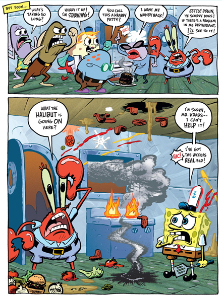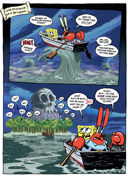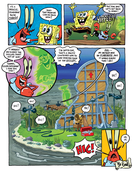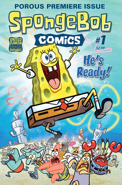
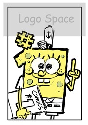
 Last year I had the pleasure of drawing and painting the cover for the first issue of SpongeBob Comics (see above).
Being the first issue, there was a LOT of behind-the-scenes work – we all wanted to give this cover a lot of impact! Here’s a look at some of the various sketches that I drew in the process of developing the cover…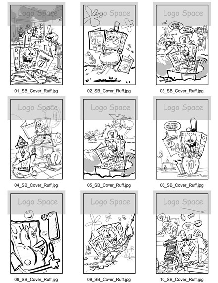
Click on the images above to get a bigger look at all those little sketches.
Here’s a look at the finished pencil art (below)…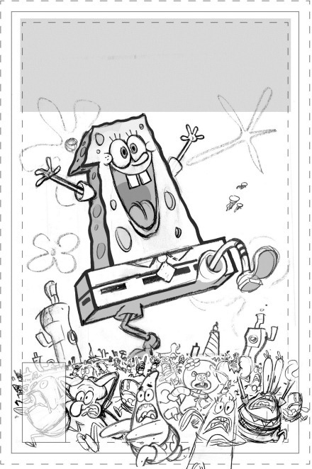
…and in the next few days I’ll be going into more detail with a lot more raw sketches from the SpongeBob Comics cover project. Check back soon for more ![]()
It’s finally here! Today is the release date for the very first issue of SpongeBob Comics! I’m very proud to say that I drew and painted the cover art for this baby!
Here is the original pencil version… Here’s the inked version below:
 …and finally the fully-painted artwork below. Completely logo-free,
but still with the crop marks and bleed lines and all that jazz.
In the next few days I’m also gonna be posting the TON of rejected preliminary drawings from this project. There’s a lot of drawings that I really like a lot, but for one reason or another they were all passed over for the version you see above. So come back soon and check ‘em out!
 And meanwhile,
 I hope you’ll all go out to your
local comics shop and pick up a copy of
SpongeBob Comics #1
ArtRage #1 - Intro to ArtRage 2.5
ArtRage #2 - Mixing Colors on the Canvas
ArtRage #3 Painting Reflective Light
ArtRage #4 - More Reflective Light & Colors
ArtRage #5 – Bump Modes & Finishing Patrick

While I was at the Kubert school, I realized that I liked drawing cartoony comics more than a superhero comics that I grew up liking. It sounds kind of strange, but it was a really big surprise to me.
Around this time, the comics that really excited me were Love and Rockets, Life in Hell, and the Kitchen Sink Press reprint of Harvey Kurtzman's Jungle Book.
Being completely ignorant of the lack of demand for funny comics, I wrote and drew a funny animal comic book story and brought it down to San Diego Comic Con to try to get a job.
A lot of people liked my samples, but most of them told me that there's no market for funny comics. I got a couple of bites from some small independent places like Apple Comics, Slave Labor, and Blackthorne Publishing. I also got some very encouraging words from Dave Stevens, Scott Saavedra, and my old hero, Mike Grell.
I came back home with a positive attitude because I had gotten a few good leads. I went back to life as usual (working at an ice cream store) until one day a package arrived on my front doorstep.
The package was from Blackthorne Publishing, and it contained a script, a contract, and 10 blank comic book pages. The job was a 10 page story for an upcoming issue of California Raisins in 3-D! It would have been nice if they had told me in advance... the deadline was in two weeks!
The first thing I had to do was ask my boss for a week off. Then I spent a couple days making thumbnail sketches and practicing drawing the characters. By the time I was ready to dive in fully, I had 10 days left to pencil and ink a 10 page professional quality story.
It was a pretty intense 10 days -- after all, this was my first job and I wanted to make a great impression. This was my way out of the ice cream store! My big break!

After I was finished, there was no way I was going to send that precious cargo through the mail. I drove the story down to the Blackthorne offices in El Cajon California.
 Some of my early influences
 are showing in these pages: on page 3, dig the Robert Crumb-style street scene.
 And the robot that answers the door on page 4 is an homage to my hero Harvey Kurtzman and his story "Henry and the Goon Child" from his early days at EC comics.
 I realize there's no lettering, but trust me -- the story wouldn't make much more sense if it had words. It was a pretty wonky script, but I wasn't about to complain.
 | And here's the hideous cover which I certainly did NOT draw. |
It was still a few more years before my career really got off the ground, but this was my first taste of working to a professional standard, and on deadline, and getting to see my work in print. There is nothing like it :-)
This is my very first Hey Arnold comic story, which was done for Nickelodeon Magazine back in 1996.

It was always a huge challenge to try to tell a complete story in two pages, so it was really important to find a way to condense the storytelling. In the first panel, I wanted to establish the setting as well as really set up the emotional empathy between Arnold and the goldfish
--------------
The rest of the first page is pretty standard stuff, but on the second page there are two panels that really stand out in my memory. The first one is a wide shot of the Japanese gardens... I really wanted to contrast this scene of openness and peace with the earlier panels that were crowded and confined.
There's no panel border here, and it helps emphasize the openness…

I also like to create a sense of depth wherever possible -- hence the foreground elements and the multilayered background.
The fifth panel on the second page is another one without a panel border. Again, I wanted to emphasize the new-found freedom that the fish has.

My favorite panel in the whole story is the last one; by showing Arnold and Gerald in the reflection of the pool, I was able to keep the emphasis on the most important story point. The irony of the last panel is that as much as the goldfish wanted to be free, it was totally afraid of its new wide-open surroundings. The clever idea that Arnold comes up with is to leave the goldfish in the bowl, and let the fishbowl float around in the beautiful pond.

I got to do about a dozen of these comic strips over the three years that I worked on the show. Supervision by Craig Bartlett, story and art by me, coloring by Steve Lowtwait.
Here’s the whole two-pager:


